CLIENT
Hi Neighbor Hospitality GroupBRIEF
Hi Neighbor Hospitality Group formed to launch their first restaurant, Stones Throw. Name in hand, to reference their close neighborhood proximity, they engaged UNIT to tell their fine dining story. The quiet neighborhood housed 10+ traditional restaurants within a 2 block radius, but they were the only one that would feature a lively atmosphere and sizeable portions and pours. They were looking to appeal to the local, mature residents, while attracting the younger San Francisco tech subsetACCOLADES
- American Graphic Design Award
SOLUTION
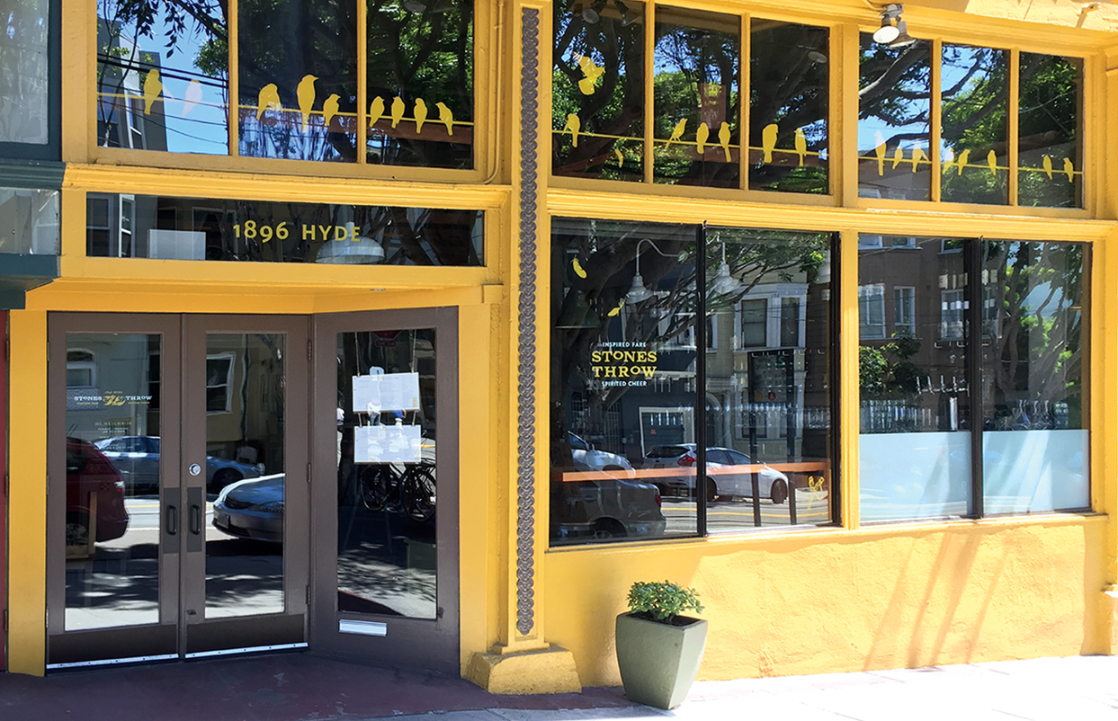
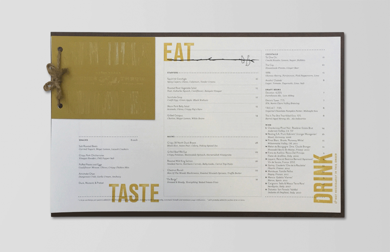
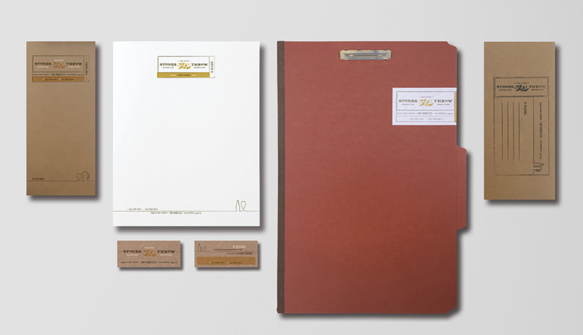
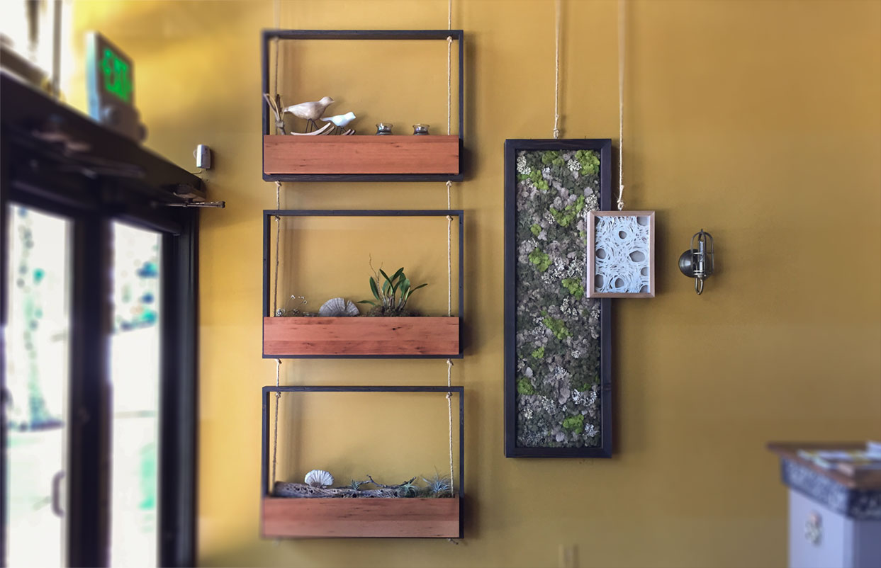
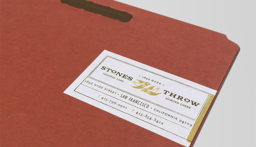
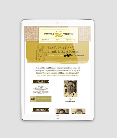
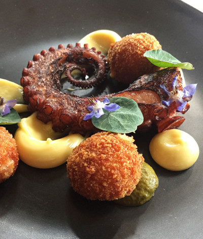
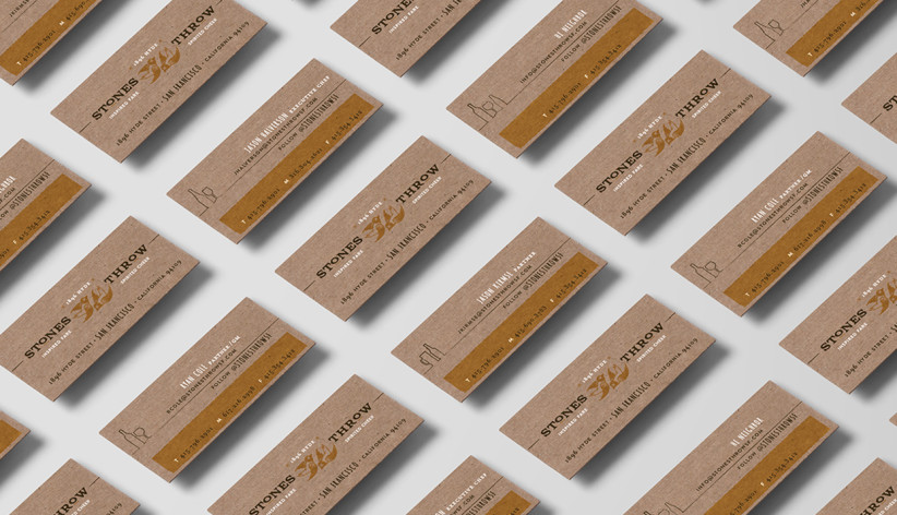
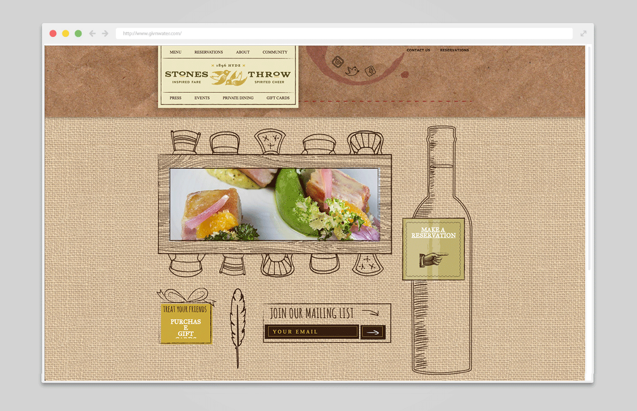
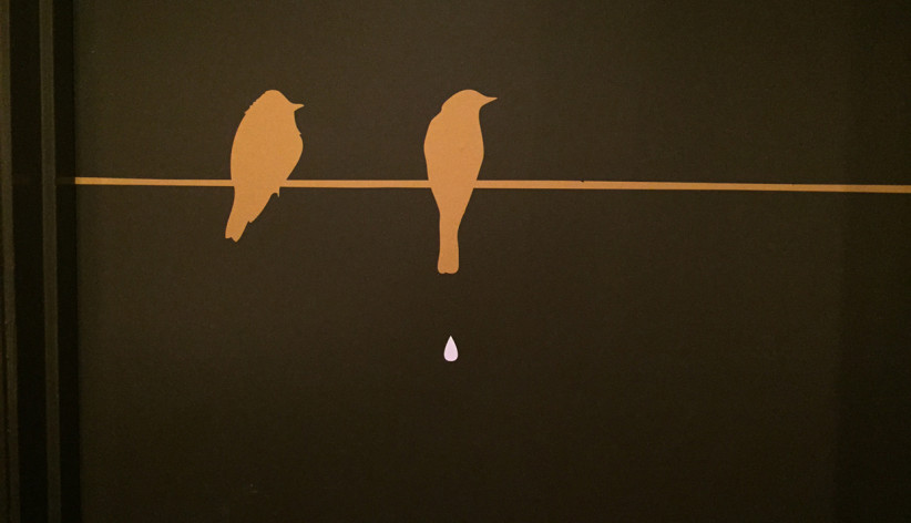
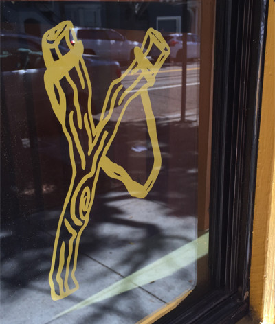
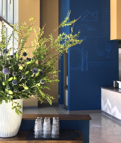
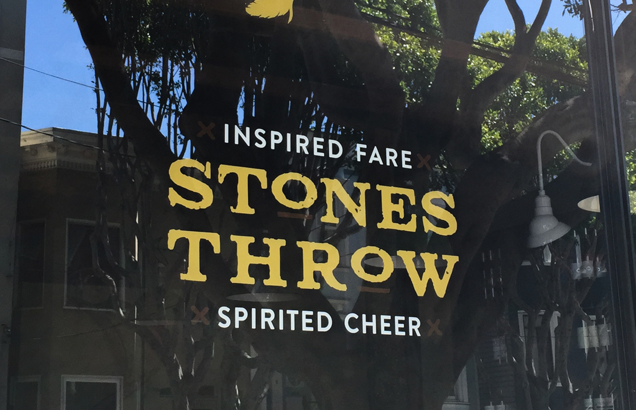
Not only were neighborhood guests just a stone’s throw away, they were also “killing two birds with one stone” by partaking in their inspired fare and spirited cheer. UNIT leveraged the client’s sense of humor by depicting two deceased birds within the logo to appeal to the new generation of techies, but used classic, centered typography to avoid alienating an older audience. A slingshot with falling feathers is hidden on the exterior window vinyls and the restroom bird droppings have become an instagram hit. We created custom planter boxes, and added nest-like artwork that included moss and paper shadow boxes.RESULTS
Their culinary know-how combined with unique branded touches, poised Stones throw for immediate success. They were able to pay off their investors within a record two years of opening, and they’ve been featured in numerous write-ups including Michael Bauer’s SF Chronicle Top 100 Restaurants. “Hi Neighbor” was included on the door vinyls as a neighborhood “hello,” and ultimately the group loved it so much, that became the name of their restaurant group. Since Stones Throw, UNIT has become their agency of record and collaborated on restaurants like Trestle, Corridor and more...CLIENT
Hi Neighbor Hospitality GroupBRIEF
Hi Neighbor Hospitality Group formed to launch their first restaurant, Stones Throw. Name in hand, to reference their close neighborhood proximity, they engaged UNIT to tell their fine dining story. The quiet neighborhood housed 10+ traditional restaurants within a 2 block radius, but they were the only one that would feature a lively atmosphere and sizeable portions and pours. They were looking to appeal to the local, mature residents, while attracting the younger San Francisco tech subset
SOLUTION
Not only were neighborhood guests just a stone’s throw away, they were also “killing two birds with one stone” by partaking in their inspired fare and spirited cheer. UNIT leveraged the client’s sense of humor by depicting two deceased birds within the logo to appeal to the new generation of techies, but used classic, centered typography to avoid alienating an older audience. A slingshot with falling feathers is hidden on the exterior window vinyls and the restroom bird droppings have become an instagram hit. We created custom planter boxes, and added nest-like artwork that included moss and paper shadow boxes.
RESULTS
Their culinary know-how combined with unique branded touches, poised Stones throw for immediate success. They were able to pay off their investors within a record two years of opening, and they’ve been featured in numerous write-ups including Michael Bauer’s SF Chronicle Top 100 Restaurants. “Hi Neighbor” was included on the door vinyls as a neighborhood “hello,” and ultimately the group loved it so much, that became the name of their restaurant group. Since Stones Throw, UNIT has become their agency of record and collaborated on restaurants like Trestle, Corridor and more...

ACCOLADES
- American Graphic Design Award