CLIENT
Che FicoBRIEF
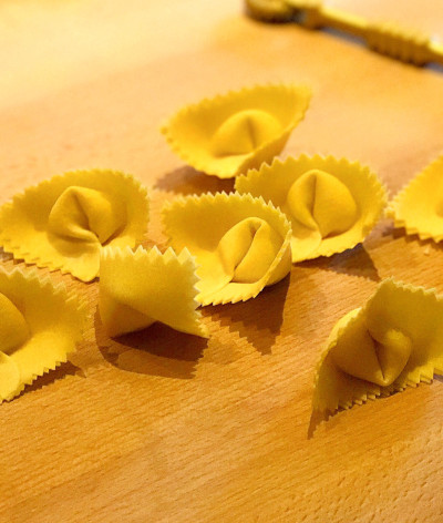
Matt Brewer and David Nayfeld were looking to bring modern Italian cuisine to the forefront. Matt’s management background in the Chicago hospitality scene, paired with David’s background at Eleven Madison Park, positioned them for one of the most anticipated restaurant launches in San Francisco. They wanted to highlight their collective love of hip hop, use of fresh ingredients from Matt’s family farm, and leverage their primal cooking techniques in the kitchen.SOLUTION
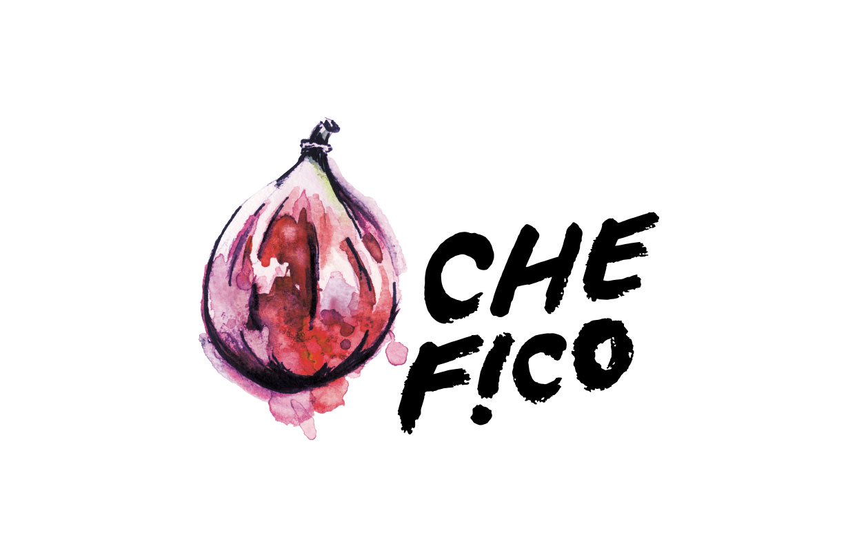
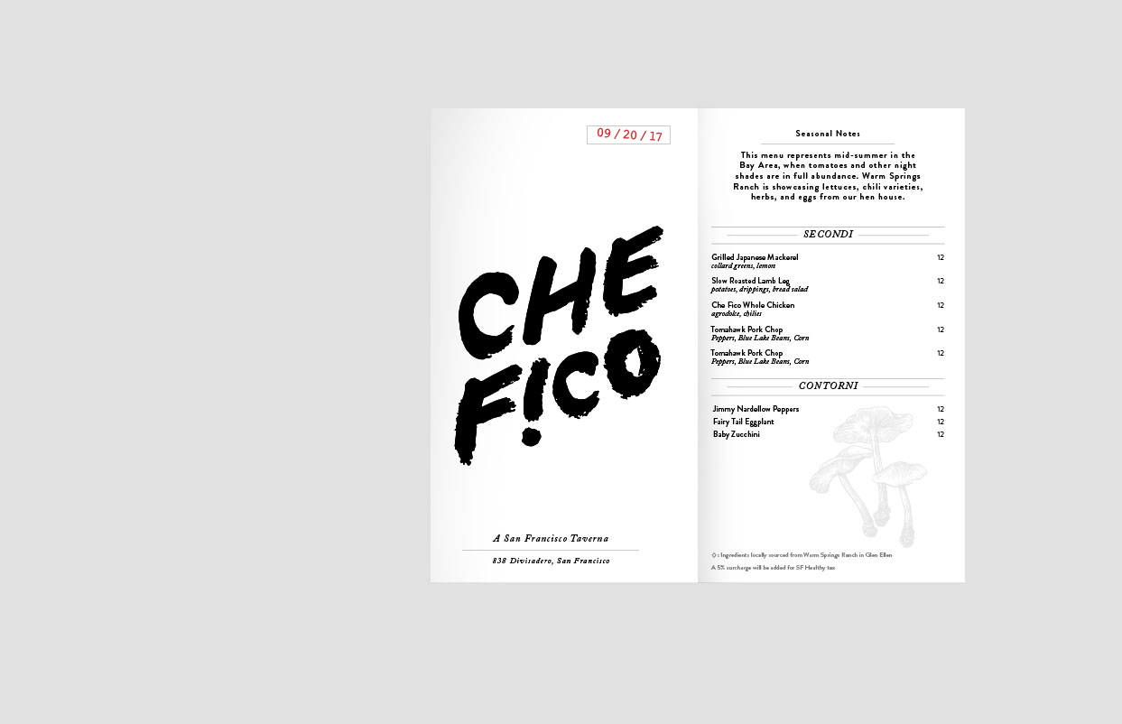
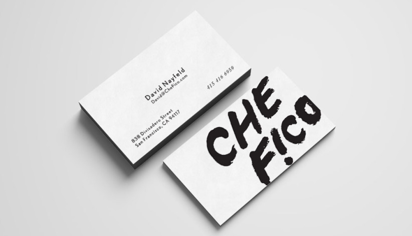
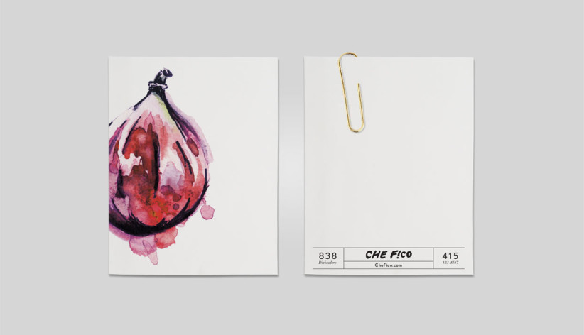
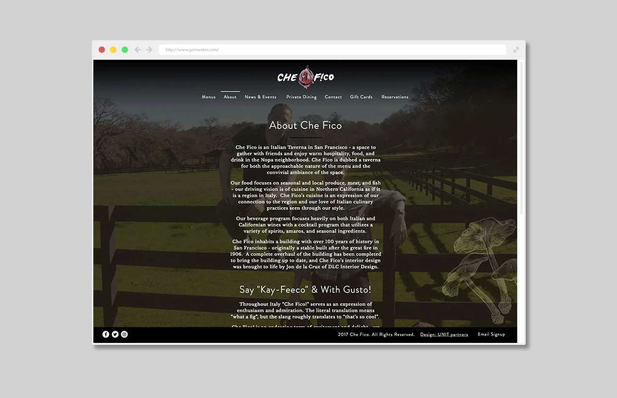
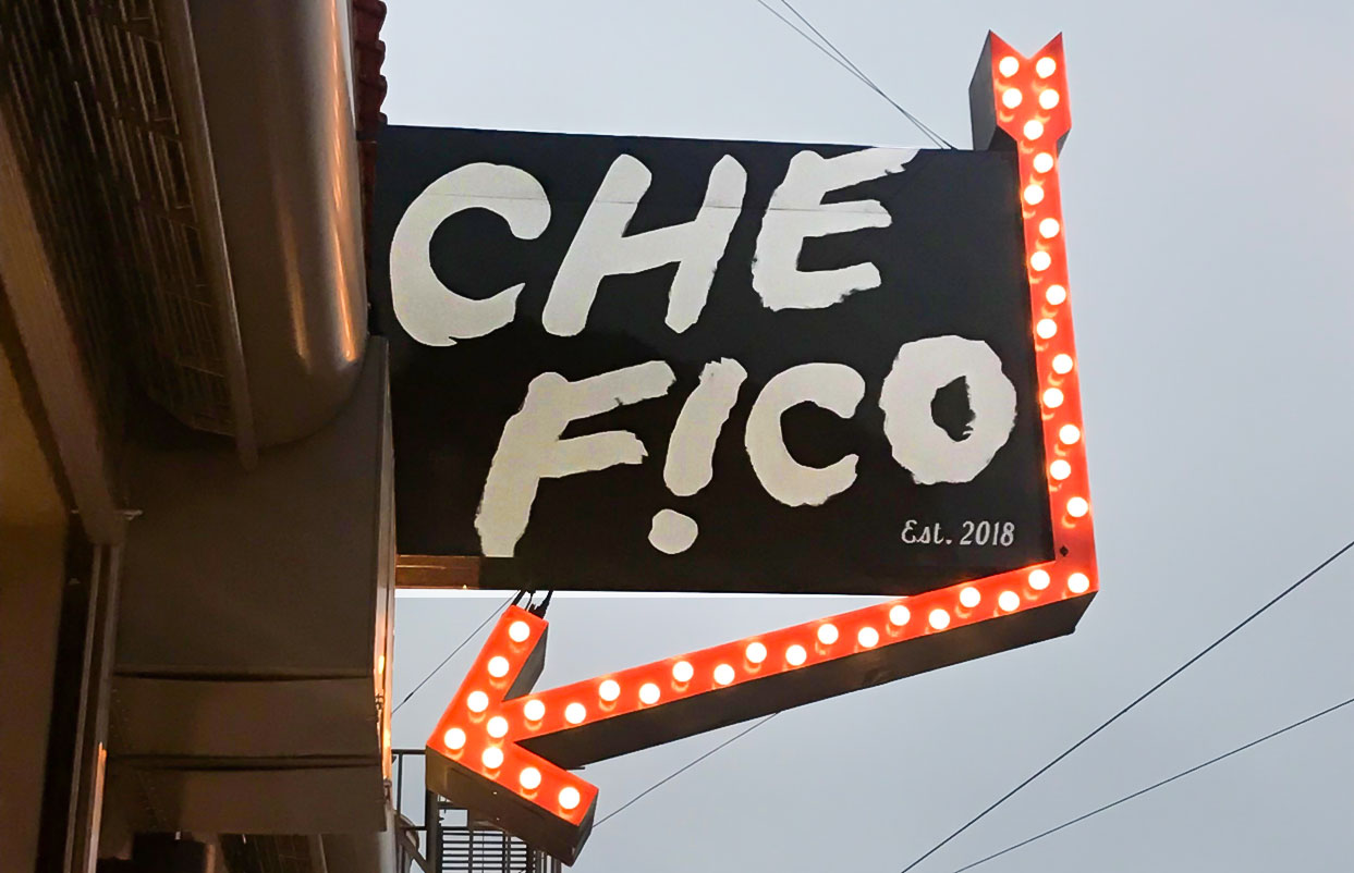
Inspired by hip hop posters and urban culture, the simple, hand painted typography and signage provides an impactful punch. Che Fico is “what the fig” or “that’s cool” in Italian, so included a fig to feel as if the juice from the fig was the ink that created the illustration – promoting David’s hands-on, whole-animal mantra. To balance graffiti textures, with a fine dining establishment, rules and ingredient etchings elegantly bind information throughout the menus and website.RESULTS
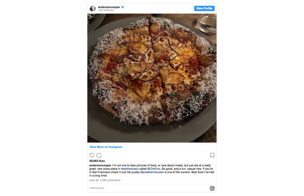
Matt and David really appreciated the brainstorming approach that allowed them to be a part of the final solution. The brand pairs perfectly with the eclectic tiles and album covers that wallpaper the space. Upon opening, Che Fico has become a culinary media darling, with critical acclaim via the Washington Post, Eater, and celebrities like Gwyneth Paltrow and Anderson Cooper. They were recently lauded by Bon Appetit as one of the Top 10 New Restaurants in the U.S..CLIENT
Che FicoBRIEF
Matt Brewer and David Nayfeld were looking to bring modern Italian cuisine to the forefront. Matt’s management background in the Chicago hospitality scene, paired with David’s background at Eleven Madison Park, positioned them for one of the most anticipated restaurant launches in San Francisco. They wanted to highlight their collective love of hip hop, use of fresh ingredients from Matt’s family farm, and leverage their primal cooking techniques in the kitchen.
SOLUTION
Inspired by hip hop posters and urban culture, the simple, hand painted typography and signage provides an impactful punch. Che Fico is “what the fig” or “that’s cool” in Italian, so included a fig to feel as if the juice from the fig was the ink that created the illustration – promoting David’s hands-on, whole-animal mantra. To balance graffiti textures, with a fine dining establishment, rules and ingredient etchings elegantly bind information throughout the menus and website.
RESULTS
Matt and David really appreciated the brainstorming approach that allowed them to be a part of the final solution. The brand pairs perfectly with the eclectic tiles and album covers that wallpaper the space. Upon opening, Che Fico has become a culinary media darling, with critical acclaim via the Washington Post, Eater, and celebrities like Gwyneth Paltrow and Anderson Cooper. They were recently lauded by Bon Appetit as one of the Top 10 New Restaurants in the U.S..