CLIENT
Semifreddi'sBRIEF
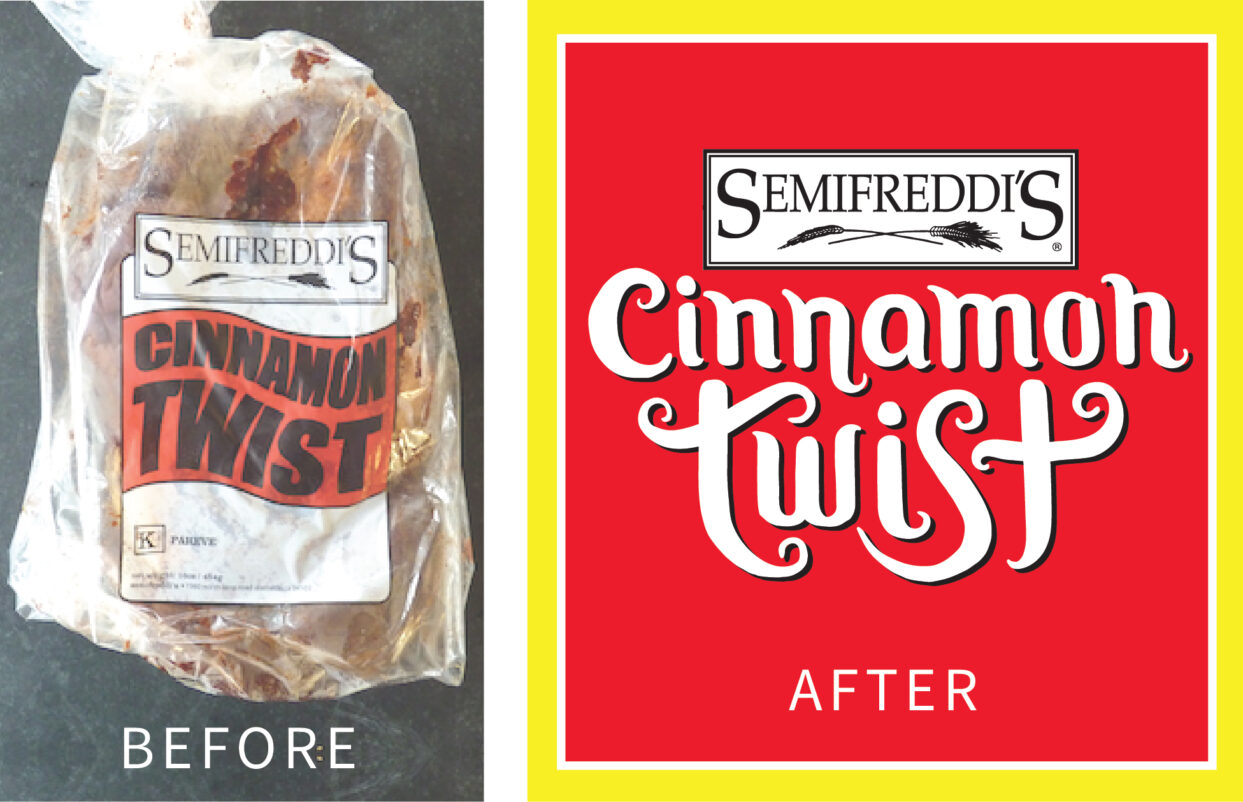
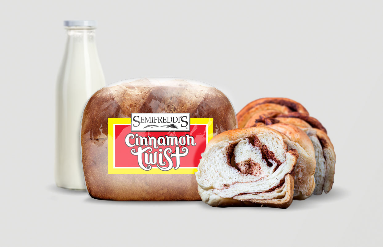
Since 1984, Semifreddi's has been filling Bay Area groceries, restaurants and more with their fresh, artisanal baked goods. With more brands on-shelf, their Cinnamon Twist bread was getting hidden amongst the masses. The family-owned business had one goal in mind – make the packaging pop off shelf.SOLUTION
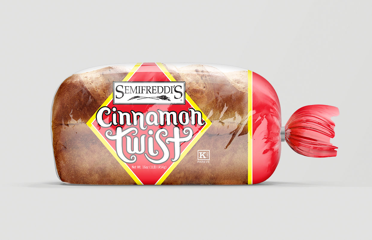
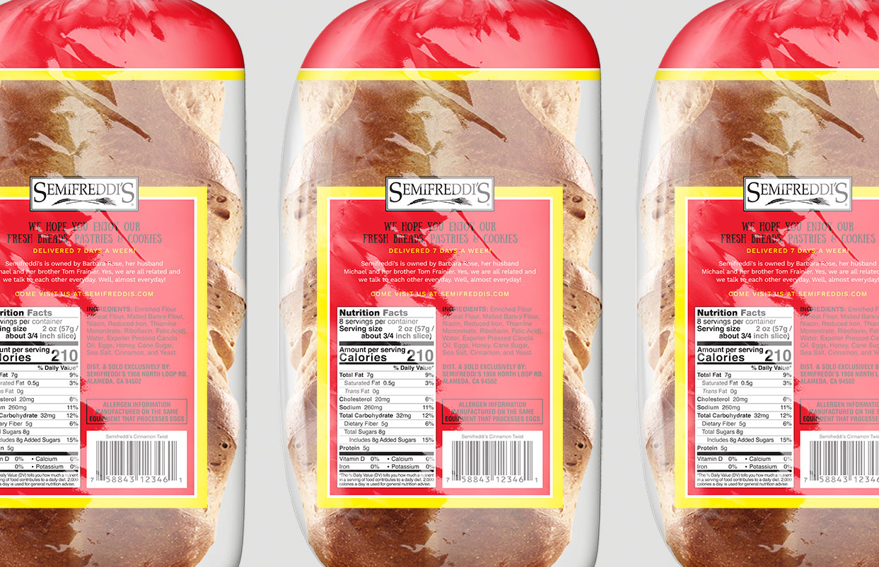
After visiting numerous grocery shelves, we found the bread inconsistently displayed – in low lighting, hidden on bottom shelves, placed end out, top down, you name it. The new packaging features a diamond shape that covers the top panels and wraps the sides, increased end graphics and boldly printed tassel to account for every possible display configuration. Armed with extensive color research we paired the minimally used Semifreddi's red with a solid yellow to give the impact needed to step apart from the competition and stand out in low light. We also used several printing techniques to increase the color boldness on the clear sleeve. Hand-drawn custom type for "Cinnamon Twist" helps showcase the hand-twisted, swirly goodness inside.RESULTS
Despite Semifreddi's long history and traditional brand presence, the packaging was well received. It achieved critical employee and customer buy-in – an astounding "99%" support, according to co-founder Tom Frainier. The design updates clearly enhanced shelf impact. The packaging hit shelves pre-COVID, just in time to increase their bottom line as grocery sales became their primary revenue generator.CLIENT
Semifreddi'sBRIEF
Since 1984, Semifreddi's has been filling Bay Area groceries, restaurants and more with their fresh, artisanal baked goods. With more brands on-shelf, their Cinnamon Twist bread was getting hidden amongst the masses. The family-owned business had one goal in mind – make the packaging pop off shelf.
SOLUTION
After visiting numerous grocery shelves, we found the bread inconsistently displayed – in low lighting, hidden on bottom shelves, placed end out, top down, you name it. The new packaging features a diamond shape that covers the top panels and wraps the sides, increased end graphics and boldly printed tassel to account for every possible display configuration. Armed with extensive color research we paired the minimally used Semifreddi's red with a solid yellow to give the impact needed to step apart from the competition and stand out in low light. We also used several printing techniques to increase the color boldness on the clear sleeve. Hand-drawn custom type for "Cinnamon Twist" helps showcase the hand-twisted, swirly goodness inside.
RESULTS
Despite Semifreddi's long history and traditional brand presence, the packaging was well received. It achieved critical employee and customer buy-in – an astounding "99%" support, according to co-founder Tom Frainier. The design updates clearly enhanced shelf impact. The packaging hit shelves pre-COVID, just in time to increase their bottom line as grocery sales became their primary revenue generator.