CLIENT
MINA Group: Indie Girl + Mindful GreensBRIEF
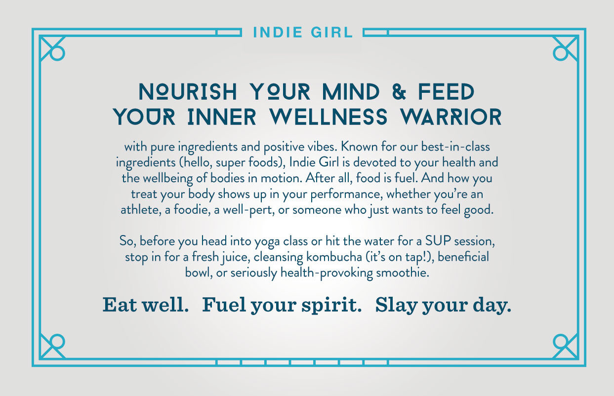
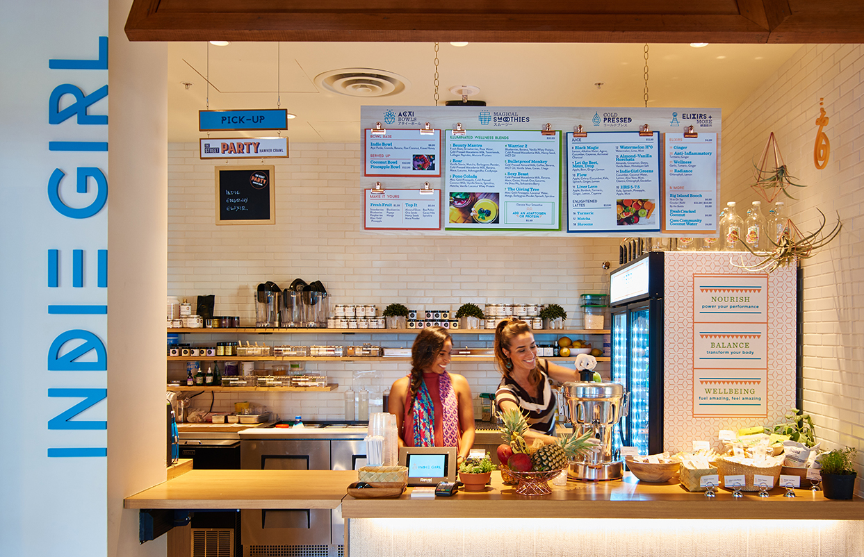
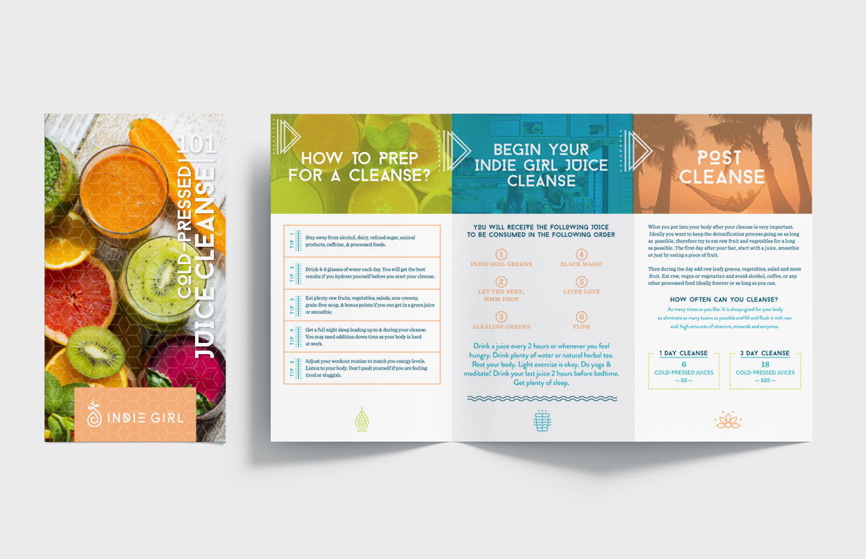
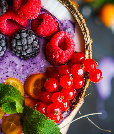
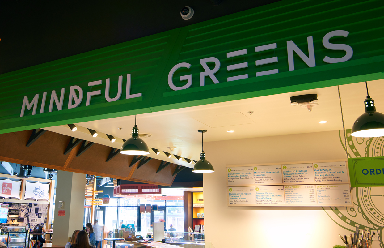
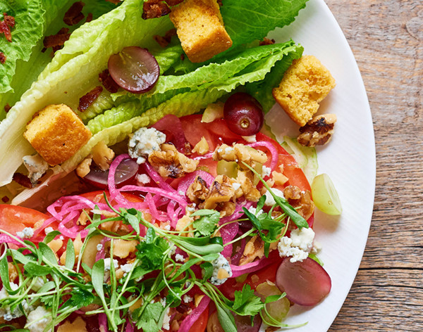
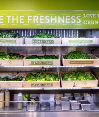
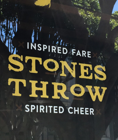
Celebrating healthy eating, these sister restaurants deliver delicious AND healthy food. Indie Girl focuses on antioxidant rich smoothies, juices and açai bowls, while Mindful Greens creates vibrant salads. Designed to live collaboratively at The Street food hall or individually in other markets, they target the next gen of health and wellness gurus. With their inaugural locations positioned in touristy Honolulu, it was imperative that the brands transcend language and culture.SOLUTION
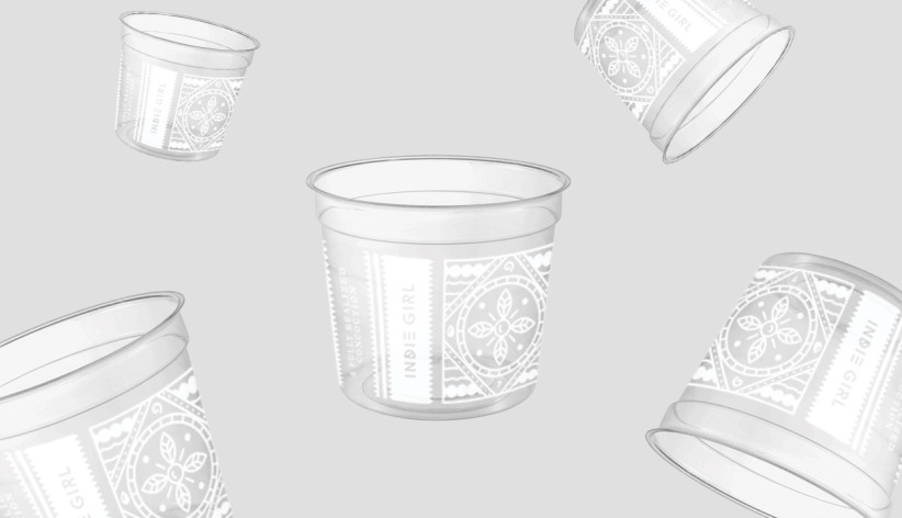
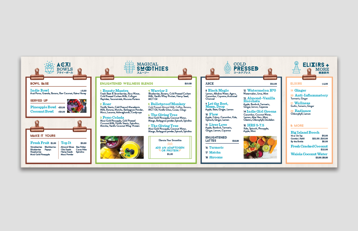
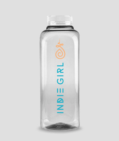
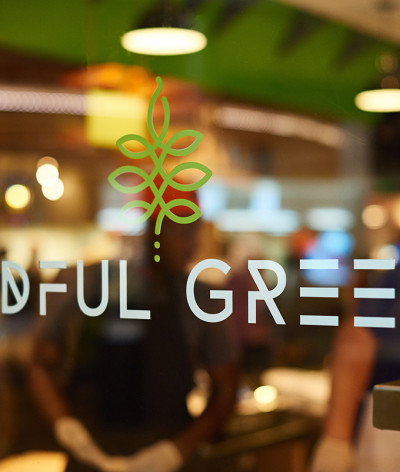
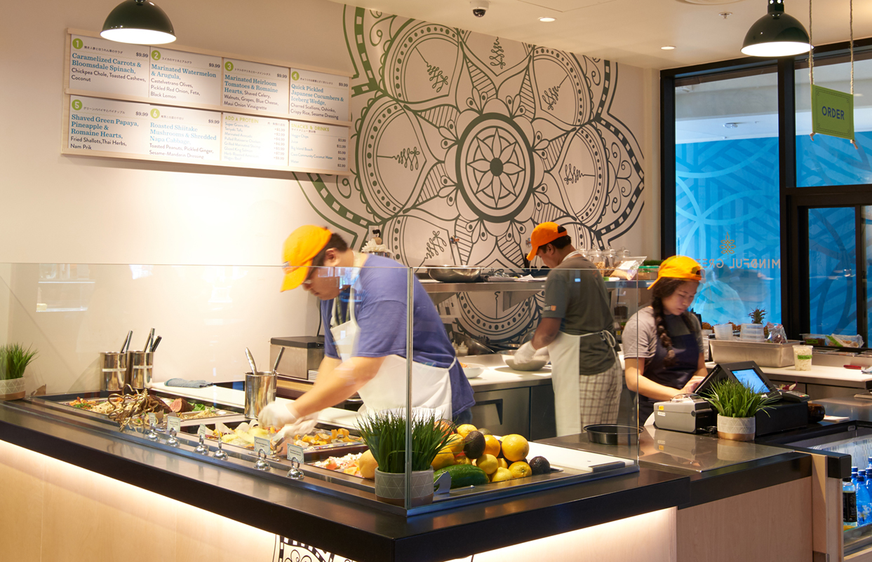
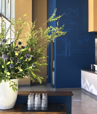
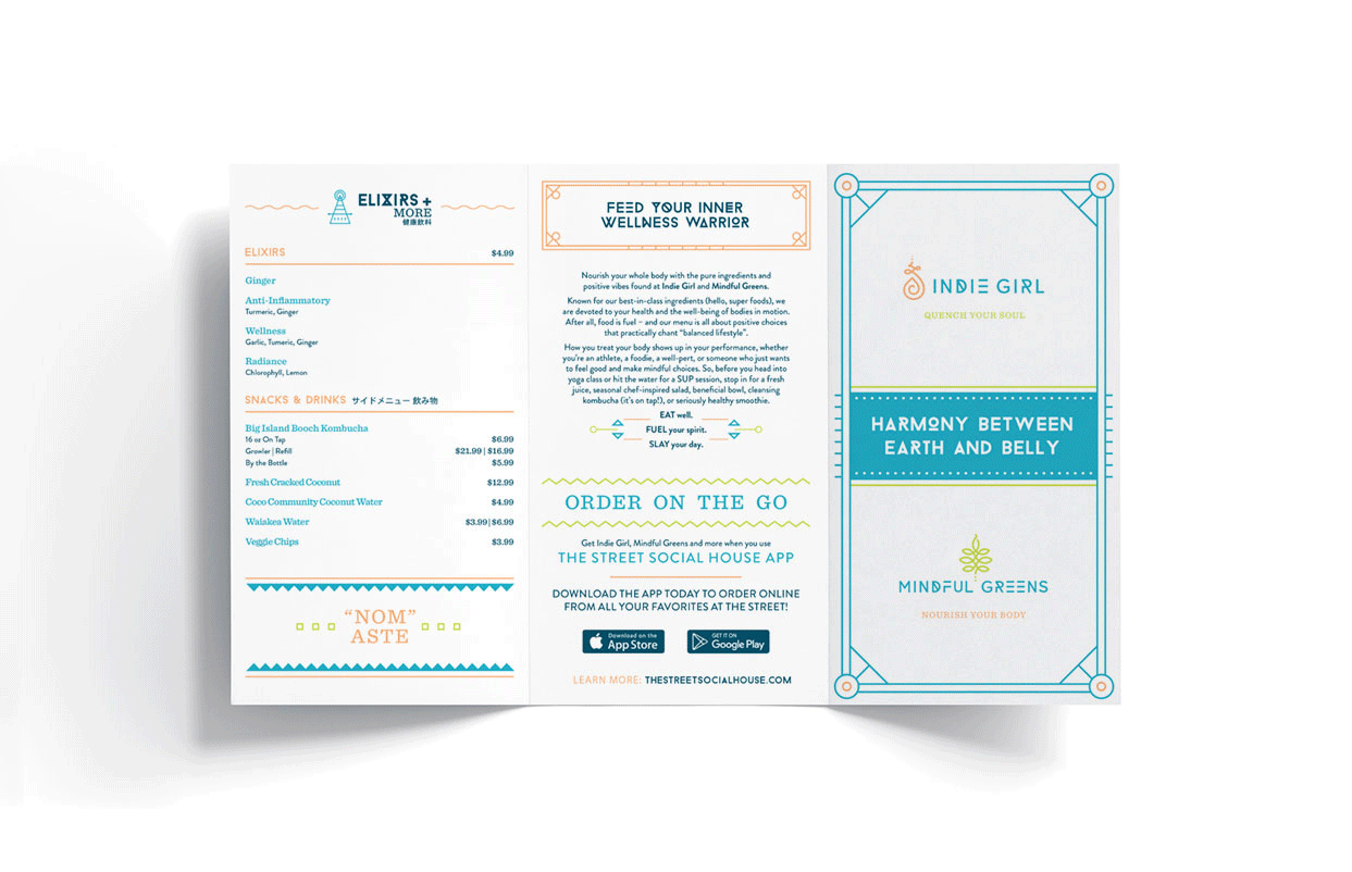
The sister brands are artfully inspired by visuals from nature, holistic healing and medieval alchemy – representative of their nutrient-dense concoctions curated for optimum results. The logo iconography is influenced by the Buddhist unalome, a series of lines with twists and turns representing the "path to enlightenment" to connect to your inner spirit. Geometric rules and shapes within icons and typography inform the alchemic equation. Icons and patterns were developed to push visuals over content for cross-culture communication. Coordinated imagery, letterforms and color palettes help align the two brands, while still allowing for their distinct brand story, signage, menu design, interior decor and disposable packaging to communicate various product benefits.RESULTS
The wellness industry has embraced the inner warrior speak, helping Indie Girl expand from Honolulu to San Francisco as Indie Superette. The Superette houses delicious made-to-order meals and retail products that are all designed to nourish the mind, body and soul.CLIENT
MINA Group: Indie Girl + Mindful GreensBRIEF
Celebrating healthy eating, these sister restaurants deliver delicious AND healthy food. Indie Girl focuses on antioxidant rich smoothies, juices and açai bowls, while Mindful Greens creates vibrant salads. Designed to live collaboratively at The Street food hall or individually in other markets, they target the next gen of health and wellness gurus. With their inaugural locations positioned in touristy Honolulu, it was imperative that the brands transcend language and culture.
SOLUTION
The sister brands are artfully inspired by visuals from nature, holistic healing and medieval alchemy – representative of their nutrient-dense concoctions curated for optimum results. The logo iconography is influenced by the Buddhist unalome, a series of lines with twists and turns representing the "path to enlightenment" to connect to your inner spirit. Geometric rules and shapes within icons and typography inform the alchemic equation. Icons and patterns were developed to push visuals over content for cross-culture communication. Coordinated imagery, letterforms and color palettes help align the two brands, while still allowing for their distinct brand story, signage, menu design, interior decor and disposable packaging to communicate various product benefits.
RESULTS
The wellness industry has embraced the inner warrior speak, helping Indie Girl expand from Honolulu to San Francisco as Indie Superette. The Superette houses delicious made-to-order meals and retail products that are all designed to nourish the mind, body and soul.