CLIENT
Flour+Water PizzeriaBRIEF
Following Flour+Water's global pasta, pizza and publishing success, Chef Thomas McNaughton and his team wanted to leverage their fine dining success with an entry into the casual market. Their signature Napolitano-style pizza with fresh, quality ingredients would be the specialty for their new Flour+Water Pizzeria. The new brand was to build on Flour+Water's rich heritage, while translating seamlessly into an expandable quick-service environment. We kept a few goals in mind: keep it simple, no pretentiousness, consider expansion opportunities, and appeal to the masses.SOLUTION
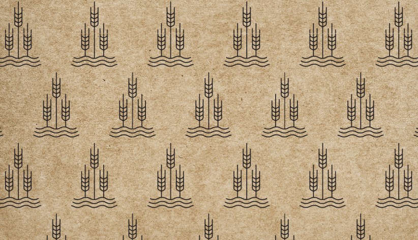
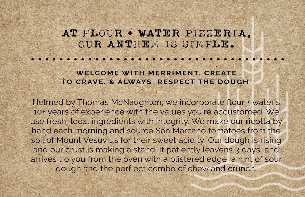
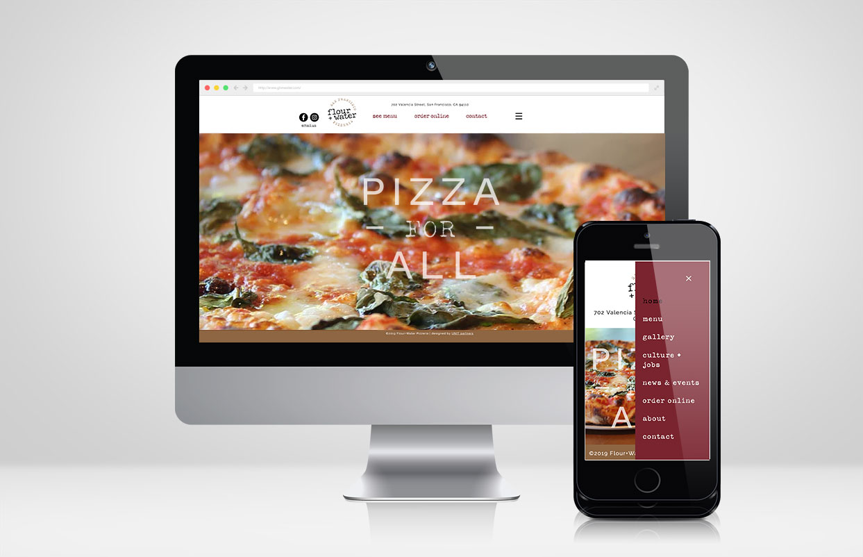
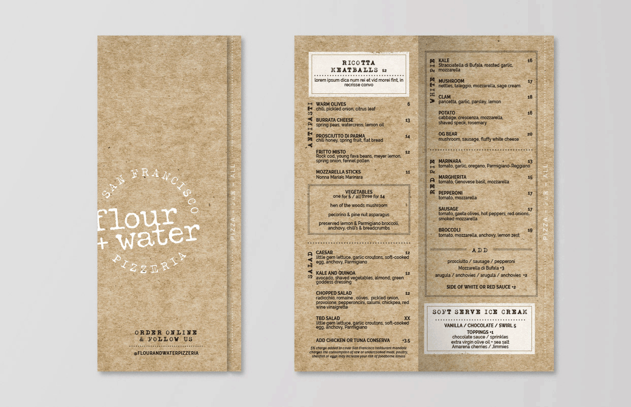
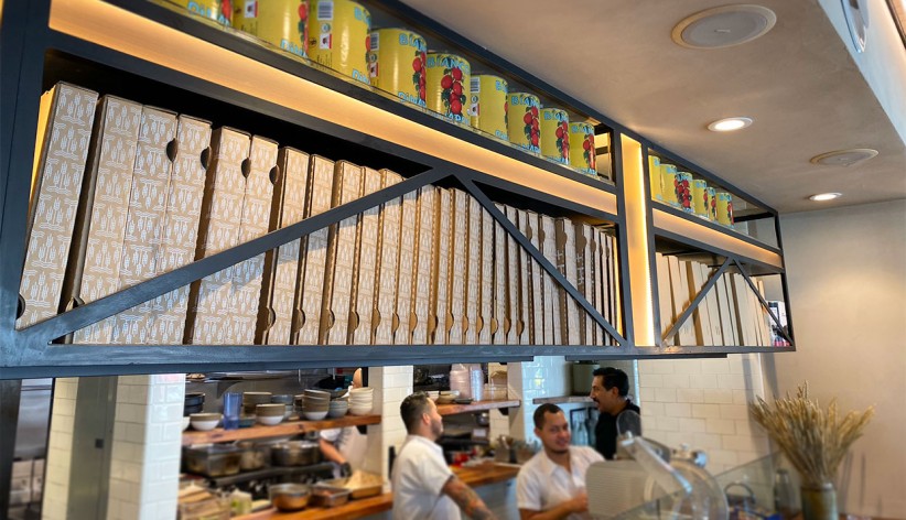
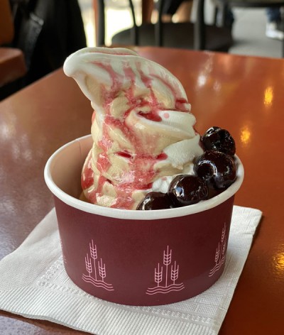
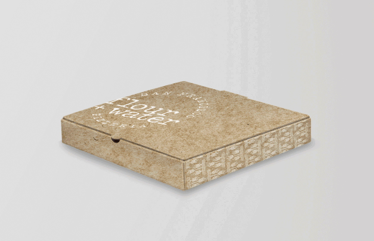
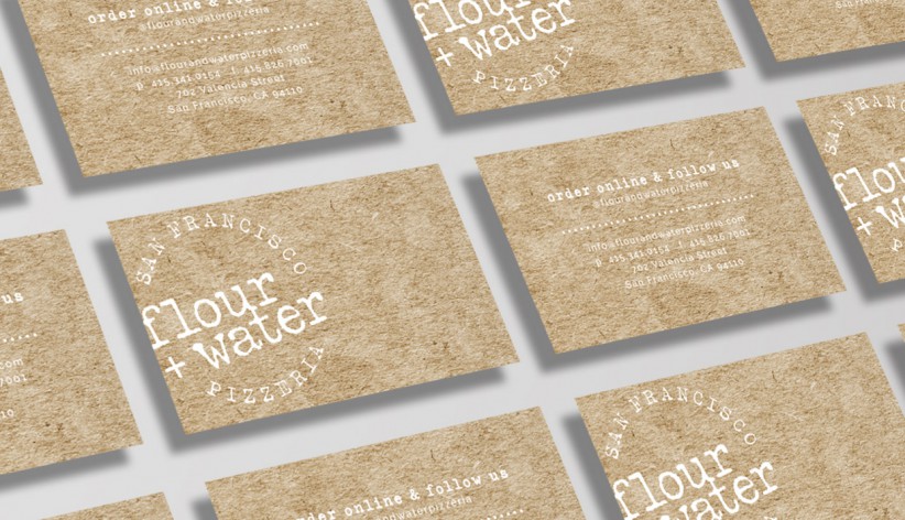
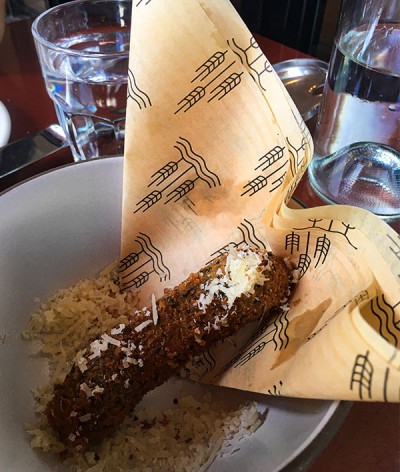
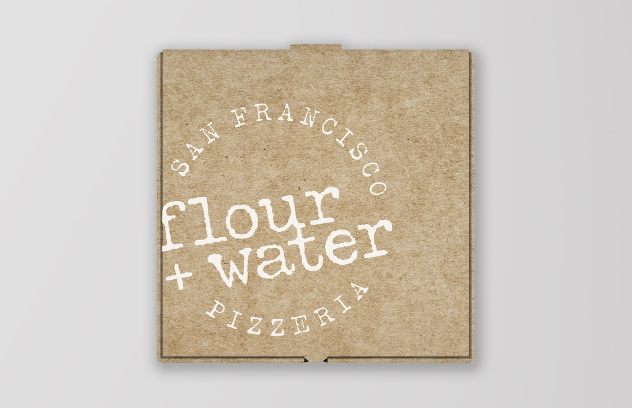
Keeping their signature Flour+Water brand became the cornerstone of the logo development. Using an iconic "pie" shape, the logo incorporates location-specific verbiage along the top – lending the opportunity for expansion. We established brand mood boards and then collaborated with KDA Architects as they flushed out the interiors based on our initial brand development. From there we created an icon to be a visual interpretation of the brand name – hence the wheat, wave, triangle. The triangle icon forges a pattern along the pizza box edges, becoming artwork that displays atop the open-concept kitchen in their compact Mission location. The clean and classic brand aesthetic expands to a website, an array of to-go items and menu. Brand "truisms" became a great way to integrate a bit of character while showcasing the brand story.RESULTS
The team was pleased with the results. It was the ideal mesh of their legacy Flour+Water brand with the new concept. The restaurant opened to critical praise and had lines out the door. In the first month, they more than exceeded their sales projections, despite waiting to launch their delivery business. The neighborhood is loving the new addition.CLIENT
Flour+Water PizzeriaBRIEF
Following Flour+Water's global pasta, pizza and publishing success, Chef Thomas McNaughton and his team wanted to leverage their fine dining success with an entry into the casual market. Their signature Napolitano-style pizza with fresh, quality ingredients would be the specialty for their new Flour+Water Pizzeria. The new brand was to build on Flour+Water's rich heritage, while translating seamlessly into an expandable quick-service environment. We kept a few goals in mind: keep it simple, no pretentiousness, consider expansion opportunities, and appeal to the masses.
SOLUTION
Keeping their signature Flour+Water brand became the cornerstone of the logo development. Using an iconic "pie" shape, the logo incorporates location-specific verbiage along the top – lending the opportunity for expansion. We established brand mood boards and then collaborated with KDA Architects as they flushed out the interiors based on our initial brand development. From there we created an icon to be a visual interpretation of the brand name – hence the wheat, wave, triangle. The triangle icon forges a pattern along the pizza box edges, becoming artwork that displays atop the open-concept kitchen in their compact Mission location. The clean and classic brand aesthetic expands to a website, an array of to-go items and menu. Brand "truisms" became a great way to integrate a bit of character while showcasing the brand story.
RESULTS
The team was pleased with the results. It was the ideal mesh of their legacy Flour+Water brand with the new concept. The restaurant opened to critical praise and had lines out the door. In the first month, they more than exceeded their sales projections, despite waiting to launch their delivery business. The neighborhood is loving the new addition.